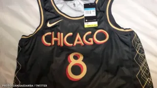
Over the past few days, fast-growing Twitter account Camisas da NBA has been releasing leaks of alternate NBA jerseys, allegedly set for use during the 2020-21 season.
Some Bulls threads popped up on their feed Sunday:
Stay in the game with the latest updates on your beloved Chicago sports teams! Sign up here for our All Access Daily newsletter.
There is, of course, not yet any way to confirm this leak’s legitimacy. But it caught the eyes of a number of fans across the Twittersphere.
Why? Well, at first glance, nothing much about the design screams Bulls, from the color scheme to the font choice and beyond. Seriously, can we get some cursive script? A Chicago flag? Anything?
Still, it’s an intricate and intriguing spread. Dive a bit deeper, and Chicago allusions abound. Let’s decode…
(Since this article's original publishing, the Bulls officially unveiled their City Edition jerseys. Scroll to bottom for the team's official explanation of the design, which differs from our speculative research, and imagery of the uniforms.)
NBA

The Font
We begin with where your eyes undoubtedly first went upon seeing the jersey: the letterhead. While the mirroring isn’t perfect, could a matching red and gold color scheme and similarly curvaceous font be a nod to the Chicago Theater (as a handful on Twitter theorized)?
It’s certainly possible. The theater celebrates its 100th anniversary in 2021, after all.
Or perhaps the lettering aligns more tidily with another Chicago staple, Union Station?
Remember the latter for later.
Touch of Art Deco
Next, cast your gaze to the side panels of the jersey. Up and down the torso are intersecting diamonds, woven together to almost psychedelic effect. It’s a pattern that screams “art deco,” a design style elemental to Chicago’s iconic architecture scene.
Here’s how Oxford defines art deco:
For a snapshot of the style’s wide-spanning influence on the city, look no further than the banks of the Chicago River, where examples such as the Merchandise Mart, Civic Opera Building and others reign.
(ChooseChicago.com has an additional guide to art deco-inspired buildings throughout the city.)
‘No Little Plans’
And finally, the tag in the bottom right corner of the jersey, which reads “No Little Plans.” Innocuous at first, but its origins are heavily linked to the Windy City.
That three-word snippet is derived from this famous quote from American architect Daniel Burnham (via the Chicago Tribune): “Make no little plans; they have no magic to stir men’s blood and probably themselves will not be realized. Make big plans; aim high in hope and work, remembering that a noble, logical diagram once recorded will never die…”
Burnham’s Chicago history runs deep. Though he was born in Henderson, NY in 1846, Encyclopedia Britannica reports Burnham first moved to Chicago with his family at age nine and attended high school in the city. After traveling a bit for further education, he returned in 1868 and forged a legendary architectural career, founding Burnham & Root — “one of the preeminent firms in the history of American architecture” — in the early 1870s alongside John Wellborn Root, and D.H. Burnham and Company later on.
Among the litany of works Burnham is at least partially credited for designing at various points in his career? The Rookery, which is mentioned in Choose Chicago’s guide to notable art deco constructions in the city; everything from the World’s Fair, of which he was executive director of works; and Chicago's Union Station. And so the dots connect.
Plus, that quote could serve as a rallying cry amid a season that has the potential to right the Bulls’ rebuild on the heels of forward-thinking overhaul across the front office and coaching staff.
Again, this is all speculation. These uniforms may never come to fruition. But if they do, despite scoffing in the face of convention, they'll represent a true-to-form, Chicago design.
UPDATE: Nov. 13, 9:00 a.m.
The Bulls confirmed the leak as their City Edition jerseys for the 2020-21 season. And with the tagline Make no little plans:
Here's how the team explained the design, via a press release:
- Gold accents to represent the lavish gold lobbies of many of Chicago’s iconic downtown buildings
- An art deco font to display the “CHICAGO” wordmark and jersey numbers, which was inspired by United Center building signage
- The iconic diamond shape featured on the shorts, which can be found on most Bulls uniforms, displaying four stars from the Chicago flag in a pattern mimicking the ironwork framing of many Chicago buildings
- “No Little Plans” displayed above the tag of the jersey – This is a tribute to Daniel Burnham, the architect and city planner who was responsible for the design of the city after the Great Chicago Fire, who said, “Make no little plans; they have no magic to stir men's blood and probably themselves will not be realized.”